The color of the year is a “corporate” shade


Pantone, the company that helps designers and artists all around the world define and communicate color, has chosen its color of the year for 2020.
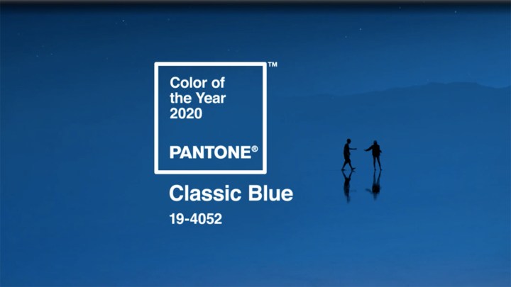
According to Pantone, “Classic Blue” instills “calm, confidence, and connection … this enduring blue hue highlights our desire for a dependable and stable foundation on which to build as we cross the threshold into a new era.”
But Kassia St Clair, design journalist and author of the book “The Secret Lives of Color,” argues that Classic Blue might actually be too safe and corporate. Marketplace’s Amy Scott spoke to St Clair about 2020’s selected color. The following is an edited transcript of their conversation.
Amy Scott: Well, as someone who writes about color and the role it plays in our lives, what do you make of this year’s choice?
Kassia St Clair: I think this choice –– although the press release that came with it talked a lot about confidence and simplicity and the reflective nature of this particular blue –– I also think it’s a rather safe and possibly, dare I say, even corporate choice.
Scott: Corporate?
St Clair: Yeah. It’s the kind of blue that you can imagine being used in logos of companies that might want you to hand over personal information, banking logos, possibly, or social media logos. Broadly what I’ve been seeing from people who care and a passionate about the Pantone color of the year, like people like me, is that people feel roughly the same. They feel it’s quite commercial, it will probably sell well, but it’s possibly a little bit of a misfire.
Scott: How would you describe this color? I was walking around the office, I realized it kind of looks like the color of recycling bins. But how would you describe it?
St Clair: That’s a good way of putting it. You know, the people who love this color have talked about it like the color of the sky at dusk just before it completely descends into night. I think it is kind of the imagined color of blueberries; not the actual color of blueberries, but the imagined color of blueberries. It’s very close to navy blue which actually, funnily enough, was selected by another company, Sherwin Williams, as their color of the year 2020 –– which I thought was quite interesting.
Scott: But it also probably won’t be lost on our listeners that 2020 is an election year here in the U.S. Pantone has picked a color with a certain political connotation. I mean, do you think that was intentional?
St Clair: I don’t. I think that in the language surrounding this choice, they’ve talked about it being reflective, confident, anchoring, and they’ve specifically wanted to go with something that isn’t divisive. Which was, again, one of the reasons why I felt this wasn’t possibly the best choice. Because inevitably, especially on social media, right after this was announced, there was a lot of talk about the “blue wave.” And I know that isn’t what Pantone would have wanted to have fed into.
Scott: Apparently, classic blue isn’t just a color, Pantone this year also created, what they called, a multi-sensory experience. What does that mean?
St Clair: Usually when there is a color of the year, there are a raft of companies with whom Pantone partner in order to create products that people can buy, that are this specific color of the year. This year, they’ve gone a step further. They really sort of thought about all your senses, so there’s a tea that you can drink that is “Classic Blue.” There’s a gin cocktail that actually looks rather nice, that I’m sort of slightly tempted by. And then there’s also a soundtrack, and this is the first time that Pantone have released a song that is meant to evoke the “Classic Blue” feeling. And what’s interesting, and I think is quite revealing, is that it’s meant to be quite a nostalgic track, and that’s something that slightly bothers me about “Classic Blue” as a choice. It doesn’t seem like a color that is looking forward and that is open to the new challenges of a new decade. Instead, it feels backward looking. I think the soundtrack that has been chosen to illustrate “Classic Blue” is quite revealing, in that it’s quite nostalgic
Stories You Might Like


There’s a lot happening in the world. Through it all, Marketplace is here for you.
You rely on Marketplace to break down the world’s events and tell you how it affects you in a fact-based, approachable way. We rely on your financial support to keep making that possible.
Your donation today powers the independent journalism that you rely on. For just $5/month, you can help sustain Marketplace so we can keep reporting on the things that matter to you.