Why Kia’s confusing new logo might actually be good for business

Why Kia’s confusing new logo might actually be good for business
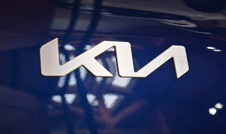
Take a drive on an American highway and look at the logos around you. Among the Toyota emblems and Subaru star clusters, you might spot another logo that, if you squint, looks kind of like the letters “KN.” It actually spells “Kia,” but has led to thousands of people Googling “KN car” every month.
James I. Bowie, a sociologist at Northern Arizona University who studies trends in logo design and branding, recently wrote about the Korean automaker’s logo for Fast Company. He spoke with “Marketplace” host Kai Ryssdal about a wider design trend (crossbar-less A’s) it’s a part of. The following is an edited transcript of their conversation:
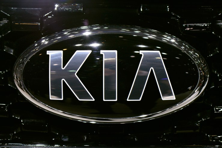
Kai Ryssdal: Could you help me understand, first of all, why Kia, a successful car brand decided to change its logo in the first place?
James I. Bowie: I think, you know, two years ago, when they brought out this new logo, I think they’re maybe looking to project more of an upscale feel. They focused on this idea of mobility and movement, I think, looking to the future, and the logo was a handy way to signal that change that they were looking for.

Ryssdal: OK, but have they succeeded? Because as I said, up in the introduction, people are confused by this thing, including me to be completely honest with you.
Bowie: I think they have succeeded. It’s been two years. Their stock appears okay.
Ryssdal: And also we’re talking about it right? So that’s a win.
Bowie: Yeah, I think the fact that 30,000 people a month are Googling “KN Car” because they don’t seem to be able to read the logo might sound initially like a bad thing. But I think it shows that people are curious, like, ‘Hey, what’s that cool car I saw?’ In my opinion, that’s better than people ignoring your product altogether.
Ryssdal: Fair enough. So in a certain world in the design world, and in the consumer curiosity world, this has become a tad trendy. Is that a good thing?
Bowie: You know, the trends in logo design seem to kind of come and go. In this case, we’re talking about crossbar-less A.
Ryssdal: Right. You jumped ahead to the next question on my list. Let’s explain crossbar-less A and how it applies in this context and then more widely.
Bowie: Well, both the old and the new Kia logos have a crossbar-less A. The new one is a little more elaborate in design, and perhaps a little harder to read. That’s a trend we’ve seen going back to the 1960s as kind of a shortcut that designers can take to maybe project an image of, you know, futurism, or modernism. We’ve seen this trend go from being 1% of A’s in logos in 1978 up to 2% in 2000, and up to 9% in the past year. I think up to a point, there’s a benefit to following one of these graphic design trends.
Ryssdal: So two things about that. No. 1, it’s interesting to me that there is a set of specialists in this country who track the percentage of crossbar-less A in logos.
Bowie: Yeah, I think that’s me.
Ryssdal: OK, yes, that’s you. But also, if everybody’s doing a crossbar-less A, is anybody doing crossbar-less A? You know what I mean?
Bowie: Yeah, exactly. Once it becomes too common, it becomes sort of like the slang word that your mother starts using. You know, perhaps this trend has gone too far.
Ryssdal: How did it come to be, by the way — this is a little off-topic, but whatever — that you as a sociologist started studying and becoming an expert in logos?
Bowie: Well, it’s a long story, your program is not that long. But in the 1990s, I was in graduate school interested in the sociology of organizations in the sociology of culture. And I started noticing in the late 1990s, there were all these dot com companies that had these switches for logos, and it was it was really prevalent at the time. And I realized, oh, logos actually are interesting intersection of these two areas that I’m interested in, organizations and culture, and started kind of following this topic, discovered that the United States Patent and Trademark Office maintains data on the graphical makeup of logos. Oh, wow. And yeah, long story short, yeah.
Ryssdal: That’s quite the dataset. All right, last thing, and I’ll let you go. Do you have an absolute favorite logo out there?
Bowie: Wow, that’s, that’s a good one. Well, just for entertainment purposes, I really like the logo of Yellow, the trucking company. They have a fairly simple wordmark, saying their name “Yellow” and it’s inside of kind of a trapezoidal holding shape, but that shape is orange. And it’s just one of these kind of non sequiturs that always tickles me every time I see it.

Stories You Might Like


There’s a lot happening in the world. Through it all, Marketplace is here for you.
You rely on Marketplace to break down the world’s events and tell you how it affects you in a fact-based, approachable way. We rely on your financial support to keep making that possible.
Your donation today powers the independent journalism that you rely on. For just $5/month, you can help sustain Marketplace so we can keep reporting on the things that matter to you.