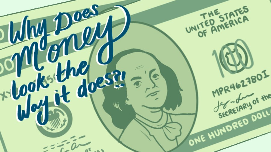
This week we’re tracking down answers to a bunch of your questions about why money looks the way it does. A lot of you were curious about stuff like why American money is green, why other countries have more colorful currency, and who decides whose picture goes on each bill. We’ll get you all those answers — and more! Plus, we’ll meet a museum’s money curator, learn about the way money art protects us from fakes and think about how we’d design our own money … if anyone asked us.

And now … tips for grown-ups listening to “Million Bazillion” with kids
Money Talks
Take a minute to recap the episode and review the key points. Here are some questions to get the kids going:
- What’s the name of the museum where money curator Ellen Feingold works?
- How can you see 26 states for just $5?
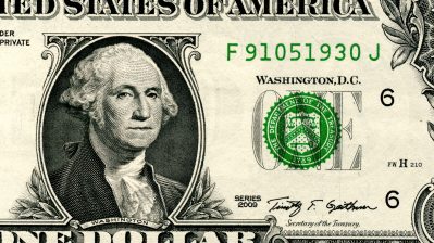
- Why are American dollar bills green?
- Why aren’t there any women depicted on American bills?
- If you could design your own money, what would it look like?
(Scroll to the bottom or click here for the answers!)
Tip Jar
This week we only scratched the surface of all the cool stuff there is to know about money and why it looks the way it does. Here are a few more goodies:
- The Smithsonian’s National Numismatic Collection, where Ellen Feingold is curator, is one of the largest collections of money on Earth!
- Here’s an article Feingold wrote about redesigning U.S. currency: “A Harriet Tubman $20? That’s Just the Beginning”
- Did you know that one company has designed a third of the world’s currency? Learn more about the 200-year history of De La Rue.
- Bonus: Listen to De La Rue currency designer Arran Mackintosh talking about how he does his job in the player below.
Gimme Five
We had so much fun with our “live audience” this week, we wanted to give you a chance to join us on this virtual stage — and try your hand at working the crowd. If you’ve got a great joke about money, we want to hear it! Share it with us here.
Money Talks answers
- The Smithsonian
- Get out a five dollar bill and look at the Lincoln Memorial on the back. If you look closely you can see the names of 26 states written across the top of the building.
- When they were first designed in the early 1860s, we only had black and white photography. The designers chose a bright color that couldn’t be reproduced just by taking a picture. Green is also seen as a trustworthy color.
- The banknotes that we use today were first designed in the 1920s. At the time, currency designers didn’t think about the role women played in the nation’s history. They wanted to use currency as a way to honor the nation’s Founding Fathers.
- Answers will vary
(Click here to return to the questions!)


The future of this podcast starts with you.
It’s official: kids love “Million Bazillion®!” From fun, creative lessons about trade to silly skits about the foundation of our economy, our team is committed to making kids and their families smarter about all things money.
We know you wish you had this podcast when you were a kid—and now you can make it possible for a child in your life.
The team


Thanks to our sponsors
-

The Ranzetta Family Charitable Fund and Next Gen Personal Finance, supports Marketplace’s work to make younger audiences smarter about the economy. Next Gen Personal Finance is a non-profit that believes all students benefit from having a financial education before they cross the stage at high school graduation.
-

Greenlight is a debit card and money app for kids and teens. Through the Greenlight app, parents can transfer money, automate allowance, manage chores, set flexible spend controls and invest for their kids’ futures (parents can invest on the platform too!) Kids and teens learn to earn, save, spend wisely, give and invest with parental approval. Our mission is to shine a light on the world of money for families and empower parents to raise financially-smart kids. We aim to create a world where every child grows up to be financially healthy and happy. Today, Greenlight serves 5 million+ parents and kids, helping them learn healthy financial habits, collectively save more than $350 million to-date and invest more than $20 million.
-

The Sy Syms Foundation: Partnering with organizations and people working for a better and more just future since 1985.


