How Amazon’s logos reflect its evolution
Share Now on:
How Amazon’s logos reflect its evolution


Amazon — like many young adults — reinvented its image several times in its adolescence.
The tech giant, founded by chief executive Jeff Bezos in 1994, celebrates its 25th birthday this Friday. Amazon, which started as an online bookstore, has since inched into every corner of our lives, selling electronics, movies, music, clothing, groceries and even houses.
But the types of products it’s sold or its market cap aren’t the only lenses through which we can view Amazon’s evolution. Its logo redesigns also highlight the immense change it’s undergone.
“Brands are so married to people’s identities now,” said Claudine Jaenichen, an associate professor at Chapman University who specializes in information design. “The power of visual language — never forget it. The good, the bad and the ugly. It really does hold some weight in how it can sway [and] persuade whole groups of people.”
Here’s a look at its different logos throughout the years, and what they can reveal about Amazon’s growing pains.
Amazon’s earliest logos, from 1995 to 1997

Amazon’s very first brand mark included a very literal interpretation of its name: an image of the Amazon River against a blue background and a caption declaring itself “Earth’s biggest bookstore.” In later versions, the company used a maroon color for the symbol.
“It seems to personify everything about desktop computing and the advent of the internet circa that time,” said Ryan Edward Russell, an associate professor of graphic design at Penn State University.
Experts like Jaenichen and Russell agree that it wasn’t exactly the most well-constructed logo.
“It looked like somebody just got a hold of Microsoft Word and just sort of went crazy with clip art,” Russell said. “That original logo was very difficult to read. It was really, really busy. It didn’t really adapt well to print.”

Jaenichen also pointed out that the river is kind of a cliché image — one that could be placed on anything.
“That river would have never conveyed a personality,” she said. “That was more of a mark of their story, but not really inviting the consumer in to be part of that story.”
1997 and 1998
A few years after its launch, Amazon ended up dropping the river symbol and adopting a new typeface.
However, it was clearly still trying to find its footing.
“[The typeface is] stretched out, so it kind of looks amateur to me. It doesn’t look like a professional design firm had grabbed hold of this yet,” Jaenichen said.
1998
In 1998, Amazon introduced a logo that experimented with upper-case letters and used a giant ring for the “O” in its name.

“To me, this one is a hard fail because it tries so hard to do multiple things,” Jaenichen noted. Maybe that O represents a bond, or a cycle, or a sun rising — she isn’t really sure.
“It’s like, ‘OK, midlife crisis. I’m gonna get a Corvette.’ This feels like that to me,” she said.
Jaenichen added that it also breaks up the company name (it looks like Amaz. On.) and said that the choice to have every letter capitalized may have made the company seem less approachable.
1998-early 2000
After the short-lived upper-case version of its logo, Amazon reverted back to a lower-case version — a decision that arguably helped the company appear more accessible.

“Lower case invites the viewer or the consumer to feel like there’s no authority. Like we get to contribute, somehow, to this company. The company’s saying, ‘Welcome, we want to hear your feedback. You are one of us,’” Jaenichen said. “It doesn’t remind us that [it is] a big conglomerate making millions of dollars off of you.”
Underneath the lettering, Amazon introduced an orange swish — a primitive form of its current “smiley face.”
A lot of companies have used some sort of curve to signify forward-thinking or movement, which may be what Amazon was trying to convey here, Jaenichen said.
As for the symbolism behind the orange hue, Russell explained that it’s a color that reinforces “joy and happiness and warmth.”
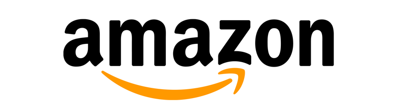
2000 to early 2012
Enter Turner Duckworth. At the turn of the millennium, this design agency created Amazon’s current logo, with its signature orange “smile” that connects the letters “a” and “z.”

“It defines Amazon as a marketplace to get everything you could want — from A to Z,” Russell said of the symbolism behind the choice.
But while it’s widely considered a smile, and has been dubbed as much by Turner Duckworth, Jaenichen thinks it’s actually more of a smirk.
“I think it’s a good smirk. It’s confident. It’s not condescending. It’s not put-offish like some smirks can be,” Jaenichen said. “That little smirk is like, ‘We know who we are.’”
Behind the scenes, the cost-conscious CEO Jeff Bezos was at every meeting during the development of the logo and (unsurprisingly) made quick decisions without involving market research.
And it looks like it didn’t need those layers of approval. Both Jaenichen and Russell say the logo reflects a huge improvement over the company’s earlier designs.
2012 to present day
In 2012, Amazon still used the logo designed by Turner Duckworth. However, it dropped the “.com” portion, reflecting its expansion beyond the internet.
“We’ve seen Amazon, as a company, take moves to move beyond online. Now we’re seeing Amazon bookstores pop up. We’re seeing Amazon now investing in brick-and-mortar stores for food,” Russell said.
“I think taking the dot.com away takes away a limitation that doesn’t apply to Amazon anymore.”
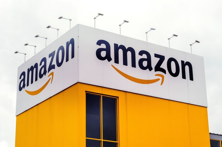
The logo has become so synonymous with Amazon that the company feels comfortable enough putting the smile (or smirk) by itself on some of the sides of its packages.
No company name, no “Earth’s biggest bookstore” pronouncement. With 100 million subscribers, Amazon doesn’t have to.
Stories You Might Like


There’s a lot happening in the world. Through it all, Marketplace is here for you.
You rely on Marketplace to break down the world’s events and tell you how it affects you in a fact-based, approachable way. We rely on your financial support to keep making that possible.
Your donation today powers the independent journalism that you rely on. For just $5/month, you can help sustain Marketplace so we can keep reporting on the things that matter to you.